Monday, August 19, 2019
WALTER SIMONSON WITH TOM PALMER STAR WARS ARTIST'S EDITION
I was lucky enough to get a copy of this beauty recently:
A wonderful book that presents colour scans of the original artwork from the comics of the 1980s.
Here are a few interesting images from inside, along with the printed versions:
The art has been flipped for this cover! I wonder why? Maybe that old chestnut of the bad guys usually coming into frame from the right. Interestingly, Simonson's signature has not been flipped, and occupies its position on the middle left on both.
A misspelling of "niether" that has been corrected in the final edition.
Tarkin with an "a" has been corrected too. Note the names sneaked into the diagram; Walt Simonson, Louise Jones (editor), and Tom Palmer.
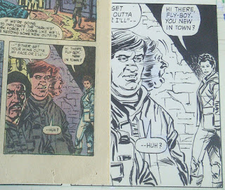
Here Leia originally said, "You new in town?" In the published version, "You" has been excised, plainly showing the space where it had been.
An interesting aspect to these three preceding examples is that the changes are not visible on the original art. There's no liquid paper on these pages. The changes must have been implemented at a later stage in the production.
I wonder what the blue tint on the foreground figure is for. Can't see anything in the printed page that would have required that. It's the only example of this in the entire book.
This one has the lines of red doing a lot of the work in the finished page. Or the "red supprint" as written in the margin. I also like seeing what are obviously fingerprint ink smudges on the original art to create texture.
These books are great, and seeing the artwork at a large scale is definitely the main draw. However, I wish they would not cut off so much of the notes in the margin. This one says something or other "to his ship". Seeing the production process is also a big part of my interest in these.
There is probably a novelty to seeing the artwork without colour for American readers. However in the UK, we were presented with these stories in black and white in the first place.
Let's end with this great image. Lobot punching Lando off of Cloud City. What's interesting here is that the foot on the right overlaps the page border. On the printed cover, all the foot is there, and the lines through the right hand side have been continued, perhaps by some production staff. This also happens to an extent at the top of the image. And the left has the top of Lando's head drawn in. It seems the entire image has been downsized slightly to fit the page. Perhaps the "Columbia Ten-Speed Racer" banner altered the usual dimensions.
An excellent book!
Subscribe to:
Post Comments (Atom)


No comments:
Post a Comment